We’ll be upfront, this started as a quick scroll through Amazon listings and turned into three hours of our lives we are never getting back. Because here’s the thing about books in the public domain, literally anyone can publish them. Your cousin who had a photoshop phase? Also eligible. The person who thinks comic sans builds character? Unfortunately, also eligible. No gatekeeping. No design standards. No one asking ‘are you sure about that American flag?’
So we did what any responsible book platform would do. We went looking. We searched archive listings, old Amazon pages, used bookshop databases, and a few dark corners of the internet we will not be revisiting. We catalogued what we found. We made a spreadsheet. We have opinions.
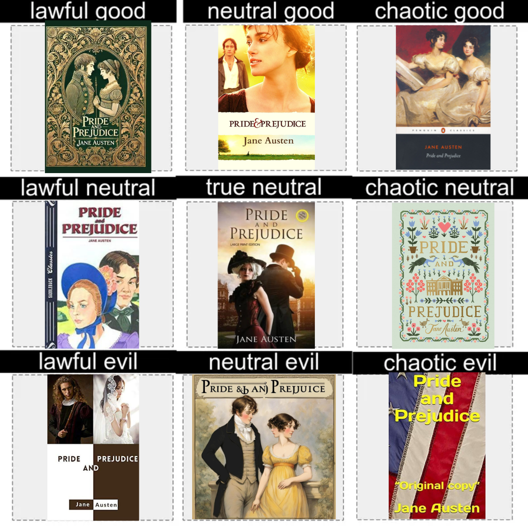
We have been collecting evidence and collected 9 covers. Some iconic, some criminal, some posted by readers who wanted us to suffer alongside them and ranked them on the only scale that matters. No notes. Only verdicts.
The good ones. Yes, they exist.
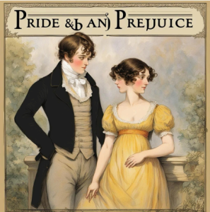
We started our research here, because we needed the baseline. What does a correct Pride & Prejudice cover actually look like?
Chaotic Good
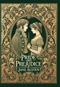
Deep green. Gold Art Nouveau filigree. A couple in Regency dress facing each other through an oval portrait window. The title is readable. The author’s name is there. The whole thing says ‘this is literature’ without explaining itself, which is exactly what good cover design does. You’d pick this up and think it’s probably not a beach read. You’d be right. It communicates the correct era, the correct tone, the correct weight. Yes it spelled everything right. Yes the hands look slightly suspicious if you zoom in. We’re giving it lawful good regardless, it earned it.
Neutral Good
This is a book cover based on the movie based on the book. Keira Knightley as Elizabeth, Matthew Macfadyen brooding in the background, golden hour English countryside at the bottom. It has all the important stuff and it doesn’t look bad. Neutral good: doing the right thing, For complicated reasons, and landing it anyway. It converts film fans into book readers. This one earns its slot, with an asterisk.

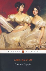
Chaotic Good
Let’s be clear: We absolutely stan lesbians and if Pride & Prejudice was about lesbians, then this cover might just work. It has the fashion of the Regency period. It follows the principles of graphic design. It gives that “Classic” vibes. And maybe you get the hint that this book is a love story. Alas, if you think it is between the two women on the cover, you will find yourself rather disappointed. At least you can argue they are two of the five Bennet sisters?
The neutral zone. Not criminal, not commendable.
This is where things got philosophically interesting for us. Covers that committed no crimes. Covers that also committed no art.
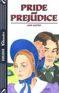
Lawful Neutral
The saddleback classics cover is technically doing its job. Two period-dressed figures. A bonnet. A look of mild concern. It screams ‘this was assigned in year 8 English and you did not finish it.’ Follow every rule. Communicates nothing beyond ‘old book, important, assigned.’ Lawful neutral: compliant. functional. hollow. The design equivalent of a work email that starts with ‘as per my last message.’ Correct. Cold. Somehow passive-aggressive about it.
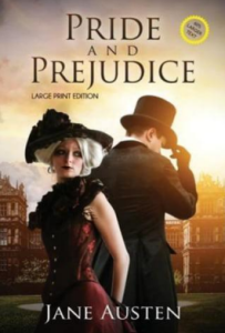
True Neutral
A woman in a dramatic red dress. A man in a top hat. A gothic manor. A golden sunset doing the absolute most. This cover is not bad. It is not good. It is vibing somewhere in the middle of existence. Important note: there is a sticker in the corner that says ‘NO LARGER TEXT’ on what is explicitly labelled a LARGE PRINT EDITION. This sticker raises more questions than this entire blog post. True neutral: the cover exists. The sticker also exists. We are all just here.
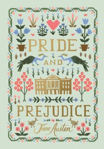
Chaotic Neutral
If I was to ask you what this book was about, could you tell me by the cover? What about the genre? Probably not. But there is history to this cover, as it is based on the “Peacock edition” of George Allen in 1894. That has a peacock on the cover. It was super popular. It even helped spur new interest in Jane Austen’s book! And so, many new peacock book covers were made. This is one. There is significance. There is symbolism. There is symmetry! But also, huh?
The ones that made us feel things (bad things)
This is the part of our research where the spreadsheet started to feel like a crime report.
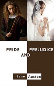
Lawful Evil
Brown side. White side. On the left, a man who is absolutely holding a wand. On the right, a bride in a veil who looks like she’s about to be explained to. The word AND is centered between them like it’s actively mediating a conflict. This cover followed every rule of graphic design, grid! contrast! two subjects! And still communicated zero things about Pride and Prejudice specifically. Lawful evil: technically correct. The worst kind of correct. Would send you a very tidy email about something that is entirely your fault.
Neutral Evil
An AI book cover from 2024. We want to be clear, AI could not spell the title of the book it was illustrating. This is what happens when you generate and don’t proofread. The illustration itself is actually pretty. Watercolour style, period-correct costumes, decent composition, a woman with two faces and debatable number of fingers. It’s like a family friendly version of Junjo Ito’s works. Neutral evil: looks fine until it doesn’t, no copyright protection either way, and Canva has spellcheck so there’s genuinely no excuse.
Chaotic Neutral
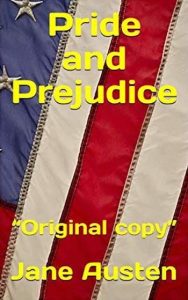
Everyone stop. Everyone, stop what you are doing. This cover has an American flag on it. The book is set in England. It was written by a British woman. In 1813. Decades before the American civil war. The font has a yellow impact. And it says, it genuinely says — “Original copy” in quotation marks. In quotation marks. As if the quotation
marks were doing anything other than raising more questions. This is not irony. Not a joke. Someone made this, looked at it, and uploaded it to amazon with a price tag. Chaotic evil. A landmark of wrongness. A monument to confidence. We will think about this for years. it is the reason this blog post exists.
So what does this all mean?
After going through hundreds of editions, what we kept coming back to is this: A cover makes a decision about who the book is for before a reader ever picks it up. The green Art Nouveau cover says literature. The 2005 film cover says you loved the movie, now read the book. AI can match the aesthetic, but it can’t replace the intention behind the design. And the American flag one says something that, frankly, we’re still processing.
At Nightstand, authors upload their own covers. Readers browse, readers click, and readers judge, in that order, in that speed. We like to say you shouldn’t judge a book by its cover, but we all do. Your cover is your first sentence. Make it say something true. We’ve built a platform where covers do the first talking. Make sure yours is saying the right thing.
Leave a Reply